Wir haben leider kein passendes Ergebnis gefunden.
UX Basics to go: Affordance
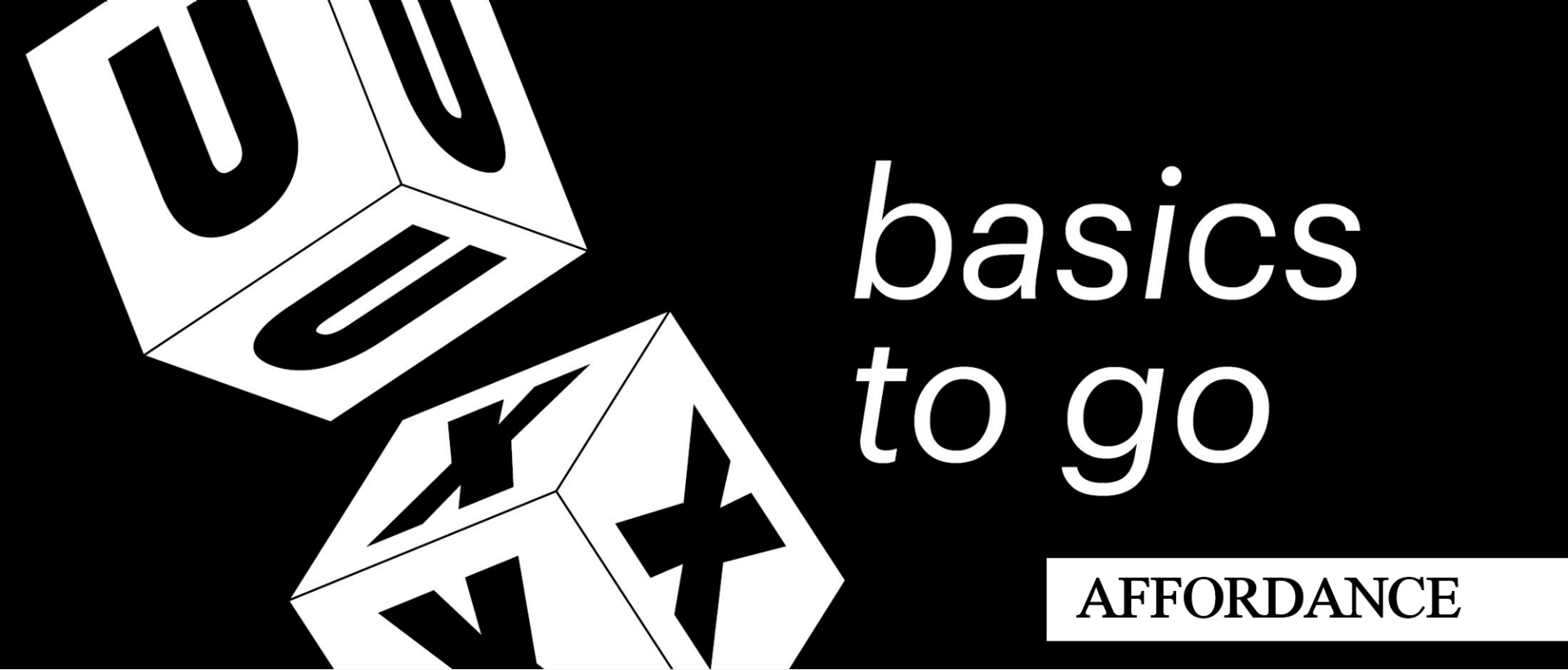
Today is about: Affordance
In the category UX Basics to go we present different user experience and usability basic concepts. Just the right thing for everyone who wants to acquire basic knowledge about UX in a short time.
Anyone who listens to a well-founded conversation about usability will sooner or later come across the term affordance. But actually, we are all surrounded by affordances all the time. So what is behind the term?
According to the official definition of UXQB, affordance is ...
... the ability of an object to explain itself. In German, Affordance is best translated as "Aufforderungungscharakter" (UXQB: International Usability and User Experience Qualification Board).
The simplest example of an affordance is the handle on a cup: It is an obvious invitation to hold the cup accordingly.
If an object has a strong affordance, it is very clear and unambiguous how to use it. Applied to digital products, a button on a website, for example, offers an affordance to click - provided the user is intuitively aware of the consequences of the click. For example, a skeumorphism button, i.e. one that resembles a real button by means of drop shadows or a 3D effect, has a more inviting character than a button in flat design.
A step backwards for the affordance? - Today, realistic skeumorphism buttons (left) are often replaced by the more modern flat design (right).
In order to enable new users to use them as intuitively as possible, it is therefore helpful in the sense of affordance to follow the following four basic principles:
Observance of applicable conventions: Internet users, for example, have learned and are therefore used to clickable links hidden behind words underlined in blue.
Labeling to achieve "correct" affordance: Adding labels to icons can help make an interface more understandable and intuitive.
Use of metaphors: e.g. an envelope as a prompt for "write new e-mail" or a trash can for "delete". Here, however, cultural conditions should be taken into account, as it can be an obstacle if metaphor is not properly understood by the user.
Continuity: similar interaction possibilities should also be designed in a similar way
Who invented it?
The originator of the concept was the perceptual psychologist James J. Gibson (The Ecological Approach to Visual Perception, 1979). In the field of human-computer interaction (HCI) has introduced the concept of Affordance Don Norman - usability pioneer and co-founder of the renowned Nielsen Norman Group. In his book "The Design of Everyday Things" (1988), he propagates the view that it is rarely the users' fault, but mostly a failure of design when the use of objects fails.
A large part of his work is concerned with the design of doors. In his opinion, the majority of doors are not designed in a user-friendly way - mainly due to a lack of challenge. Have you ever pressed a door, even though you could clearly read "pull" on it? If so, you have already made the acquaintance of a so-called "Norman Door". This video shows that you are not alone in this.
UX interest aroused?
Do you want to go deeper into the subject of usability? Perhaps you are interested in our Facit Digital User Experience Training In this two-day training you can acquire all basic knowledge about usability and user experience.

Theresa Amberger
As a studied communication scientist Theresa asks many questions and likes to get to the bottom of things, as for example for the blog series "Inside FaDi". In UX Consulting at Facit Digital, she can optimally combine this passion with her interest in digital trends and technological innovations.